In the world of design, white space is often overlooked. Many people see it as empty or wasted space. However, this perception couldn’t be further from the truth. White space, also known as negative space, plays a critical role in shaping user experience.
First and foremost, white space enhances readability. When text and images have room to breathe, users can process information more easily. This clarity helps guide their attention to important elements, such as calls to action. Consequently, well-placed blank space can significantly improve engagement.
Moreover, effective use of white space creates a sense of balance. A cluttered design can overwhelm users and lead to frustration. In contrast, a balanced layout feels inviting and organized. This not only reflects professionalism but also strengthens brand identity.
Ultimately, leveraging blank space strategically can transform your designs. By prioritizing clarity and focus, you enhance the overall user experience. As we delve deeper into this topic, you’ll discover practical strategies for incorporating white space into your projects.
Understanding White Space
White space refers to the empty areas surrounding design elements such as text, images, and buttons. It’s important to understand that this space doesn’t have to be white; it can be any color or texture, as long as it remains devoid of visual content. This concept is often misunderstood, yet it plays a vital role in effective design.
Moreover, white space is essential for guiding the viewer’s attention. By strategically placing empty areas, designers can highlight key elements and messages. This focused approach helps users navigate through content more easily. As a result, they are more likely to engage with important information.
Additionally, white space significantly enhances the overall user experience. It creates breathing room around elements, allowing users to absorb information without feeling overwhelmed. This clarity not only improves readability but also fosters a sense of balance within the design.
White space is a powerful tool that should not be underestimated. By incorporating it thoughtfully, designers can create layouts that are both visually appealing and user-friendly. Embracing blank space ultimately leads to a more engaging and effective design experience.
Benefits of White Space
Enhanced Readability
One of the primary benefits of blank space is enhanced readability. When text is surrounded by adequate spacing, it becomes easier for users to read and comprehend. This clarity allows readers to process information without straining their eyes. Consequently, well-spaced content encourages users to stay engaged longer.
Additionally, proper spacing helps prevent visual clutter. A clean layout minimizes distractions, allowing users to focus on the message. As a result, readers can navigate through the content with greater ease and confidence.
Improved Focus
White space also plays a crucial role in directing attention to key messages or elements. By strategically placing empty areas around important content, designers can guide users’ eyes where they need to go. This focused approach ensures that critical information stands out effectively.
Moreover, this technique enhances user interaction with calls to action. When buttons or links have sufficient breathing room, they become more noticeable. Consequently, users are more likely to engage with these elements, leading to better conversion rates.
Visual Balance
Another significant advantage of white space is the creation of visual balance. A well-designed layout feels harmonious and organized, which enhances the overall aesthetic appeal. When elements are spaced appropriately, the design appears more polished and professional.
Furthermore, visual balance fosters a sense of calm for users. A cluttered design can be overwhelming and distracting. In contrast, a balanced layout invites users to explore the content comfortably, making their experience more enjoyable.
Types of White Space
Micro White Space
Micro white space refers to the small gaps found between letters, lines of text, and other design components. This type of spacing is crucial for enhancing legibility. When letters are spaced appropriately, reading becomes easier and more enjoyable. For instance, a well-designed online magazine like Medium utilizes adequate line spacing in its articles, allowing readers to navigate the text without strain.
Additionally, micro white space helps prevent visual clutter. When elements are too close together, they can overwhelm the viewer. A great example of this is the Mailchimp email marketing platform. By incorporating micro spacing between buttons, text, and images, Mailchimp creates a cleaner look that directs attention to individual elements. This subtle technique ensures that users can easily absorb information without distractions.
Moreover, micro white space contributes to the overall aesthetic of a design. It adds a level of sophistication and polish. For instance, Spotify uses micro white space effectively in its app interface. The spacing between song titles and album art enhances the visual appeal and professionalism of the layout. This attention to detail can significantly impact how users perceive the brand or message.
Micro white space is a vital component in any design. By improving readability and reducing clutter, it plays an essential role in creating a positive user experience across various platforms and applications.

Macro White Space
Macro white space refers to larger gaps between major elements within a design, such as sections or images. This type of spacing is essential for establishing hierarchy and guiding the viewer’s eye through the layout. For example, on the Google homepage, ample macro space allows users to focus primarily on the search bar without distractions.
Furthermore, macro white space helps organize content effectively. By separating different sections, it creates a clear structure that enhances navigation. Users can easily identify where one section ends and another begins. This clarity is especially important in complex designs where information must be presented logically.
Additionally, macro white space contributes to a sense of balance within the design. A well-balanced layout feels harmonious and inviting. When elements have enough breathing room, the overall aesthetic becomes more appealing. This visual balance can make a significant difference in how users engage with the content.
Macro white space is crucial for effective design. By promoting clarity and organization, it enhances user experience while contributing to a polished and professional look.

Principles for Using White Space Effectively
Embrace Minimalism
Embracing minimalism is crucial for effective design. Minimalist designs rely heavily on white space to create a clean and uncluttered look. By removing unnecessary elements, you allow the remaining components to breathe. This approach not only simplifies the layout but also enhances user focus on essential content.
Additionally, minimalism promotes clarity. When users encounter fewer distractions, they can navigate the design more easily. This streamlined experience encourages engagement and makes the content more digestible. Ultimately, adopting a minimalist philosophy can elevate your design to new heights.
Prioritize Content
Prioritizing content is another essential principle when using white space. Start by identifying the key messages in your design. Once you have established these focal points, allocate sufficient white space around them. This technique effectively draws attention to important elements, such as headlines or call-to-action buttons.
Moreover, strategic spacing helps guide the viewer’s eye naturally. When users see ample blank space surrounding critical information, they instinctively know where to focus. This clarity enhances their overall experience and improves interaction with your content.
Use Grid Systems
Using grid systems is an effective way to maintain consistent spacing throughout your layout. Grids provide a structured framework for organizing content. This organization contributes to a clean and orderly appearance that users appreciate.
Furthermore, grid systems help ensure that elements are aligned properly. When design components are well-placed within a grid, it creates visual harmony. This consistency not only improves aesthetics but also enhances usability, making it easier for users to navigate your design.
Experiment with Asymmetry
Experimenting with asymmetry can add dynamic interest to your designs. While balance is important, asymmetrical layouts can create engaging visuals that capture attention. By using white space strategically in asymmetrical designs, you can maintain a sense of balance despite the uneven placement of elements.
Additionally, asymmetry encourages creativity and innovation in design. It allows for unique arrangements that can make your work stand out. This approach not only keeps viewers intrigued but also enhances their overall experience with your content.
Real-World Examples of Effective White Space Use
Apple
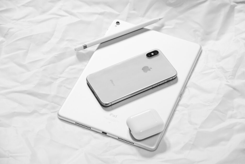
Apple’s website is a prime example of effective white space utilization. The design allows product images ample breathing room, creating a clean and minimalist aesthetic. This approach not only enhances user experience but also reinforces Apple’s brand identity of sophistication and elegance. Users are immediately drawn to the sleek product displays without feeling overwhelmed.
Furthermore, the strategic use of blank space directs attention to key elements, such as product features and calls to action. By minimizing distractions, Apple ensures that visitors can focus on what matters most. This clarity not only improves navigation but also encourages users to explore further, ultimately leading to higher engagement and conversion rates.
Apple’s website demonstrates how blank space can elevate a brand’s online presence. By creating an inviting and organized layout, Apple effectively showcases its products while enhancing the overall user experience.
Airbnb
Airbnb’s homepage exemplifies the effective use of white space to create an inviting atmosphere. The clean layout allows users to focus on the search functionality, which is the primary goal of the page. With ample white space surrounding key elements, visitors can navigate effortlessly without feeling overwhelmed by information.
Moreover, Airbnb employs high-quality imagery that captures attention while maintaining a minimalist design. This combination not only highlights various destinations but also evokes a sense of wanderlust. As users scroll through the homepage, they are guided naturally through the content, making it easy to find what they need.
In conclusion, Airbnb’s design effectively balances functionality and aesthetics through strategic blank space usage. By prioritizing user experience, Airbnb creates a seamless journey for travelers looking for their next adventure.

Dropbox
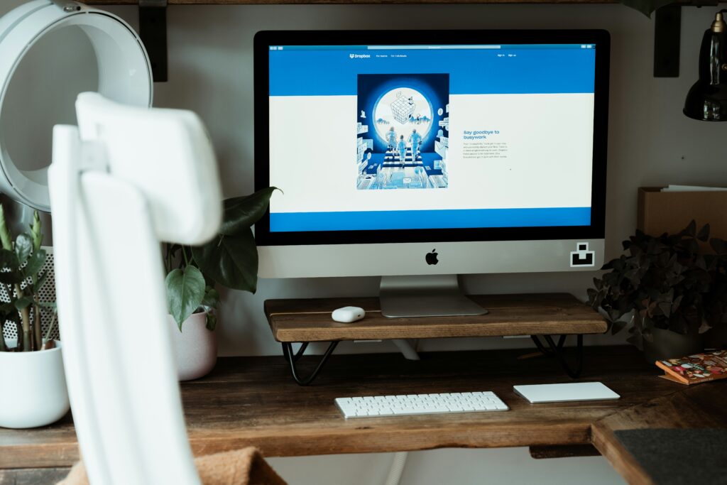
Dropbox leverages white space effectively to simplify complex information on its website. The design focuses on clarity, allowing users to navigate through various services without feeling overwhelmed. By using blank space strategically, Dropbox ensures that essential features stand out prominently.
Additionally, the layout incorporates clear headings and concise descriptions that are easy to digest. This approach helps users quickly grasp the offerings without sifting through excessive text. The ample spacing between sections contributes to a clean and organized appearance, enhancing overall usability.
In summary, Dropbox’s website demonstrates how effective white space can improve user experience. By simplifying information and maintaining a visually appealing layout, Dropbox ensures that users can navigate its services with ease and confidence.
Conclusion
Incorporating white space into your design strategy goes beyond mere aesthetics. It plays a vital role in enhancing clarity and focus for your audience. By understanding the different types and principles of white space, you can create layouts that effectively guide viewers through your content. This intentional approach not only improves readability but also fosters a more engaging experience.
Moreover, embracing the power of white space can significantly elevate your brand’s visual communication. When used thoughtfully, it reinforces your message and highlights key elements. As a result, users are more likely to connect with your content and engage with your brand.
Additionally, by following the insights shared about blank space, you can enhance your design projects in meaningful ways. Improved user interaction leads to higher satisfaction levels. Ultimately, a well-designed layout that utilizes white space effectively can make a lasting impression on your audience.
In summary, white space is an essential tool in modern design. By prioritizing its use, you create an inviting environment that encourages exploration and interaction. Embrace this powerful element to transform your designs and elevate user experiences.

