Color isn’t just a visual experience; it’s a psychological phenomenon that deeply influences how we perceive the world around us. From the moment we wake up, hues influence our emotions, behaviors, and decisions. Colors shape our environment daily. This influence is especially strong in branding, where color shapes consumer perceptions. It also helps create a strong brand identity.
Now, imagine walking into a store where the branding is dominated by calming blues as well as serene greens. In such a setting, the colors work together to create a peaceful and welcoming atmosphere. You might instantly feel a sense of trust, peace, and relaxation. Now, imagine a brand using bold reds and oranges. These hues can evoke urgency, excitement, or even hunger. This is how color psychology works: it influences our feelings and choices in subtle ways that we are unaware of.
In branding, understanding and using color psychology is essential to forming a lasting connection with your audience. Colors are a vital component of your brand’s identity since they may trigger specific emotions and associations. A strong brand can become great with the right color scheme. This helps it stand out and connect deeply with its target audience in a crowded market.
It’s not just about picking colors that look good together. It’s about selecting hues that align with your brand’s values, message, and desired emotions. Your color choices can make or break your brand’s connection with customers. Whether conveying luxury with blacks, building trust with blues, or creating excitement with reds, the right hues are essential.
In this blog, we’ll explore the intriguing world of color psychology. Discover how to harness hues to craft a brand identity that resonates with your audience. We’ll cover everything from the psychological effects of colors to creating a cohesive palette that reflects your brand’s essence. So, let’s embark on this colorful journey and unleash the full potential of color psychology in your branding efforts!
The Psychology Behind Colors
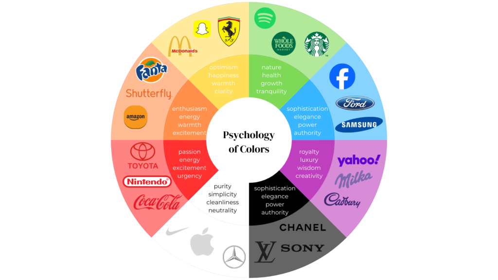
Colors have an innate ability to influence our emotions and perceptions. This section explores the psychology behind different hues and how they impact consumer behavior:
1. Blue: The Color of Trust and Reliability
Blue is a color universally associated with trust, reliability, and professionalism. It’s a calming hue that evokes peace and stability. Hence, it’s popular for brands in finance, healthcare, and technology, where trust is essential. Blue exudes calmness and instills confidence, making it a popular choice for branding in businesses like PayPal and IBM.
For example, PayPal uses blue in its logo and interface to instill confidence during online financial transactions. Similarly, IBM, known as “Big Blue,” uses the color to reinforce its long-standing reputation for reliability and technological expertise. By incorporating blue into their branding, these companies communicate dependability and professionalism, essential qualities for maintaining customer trust.

2. Red: The Color of Energy and Urgency
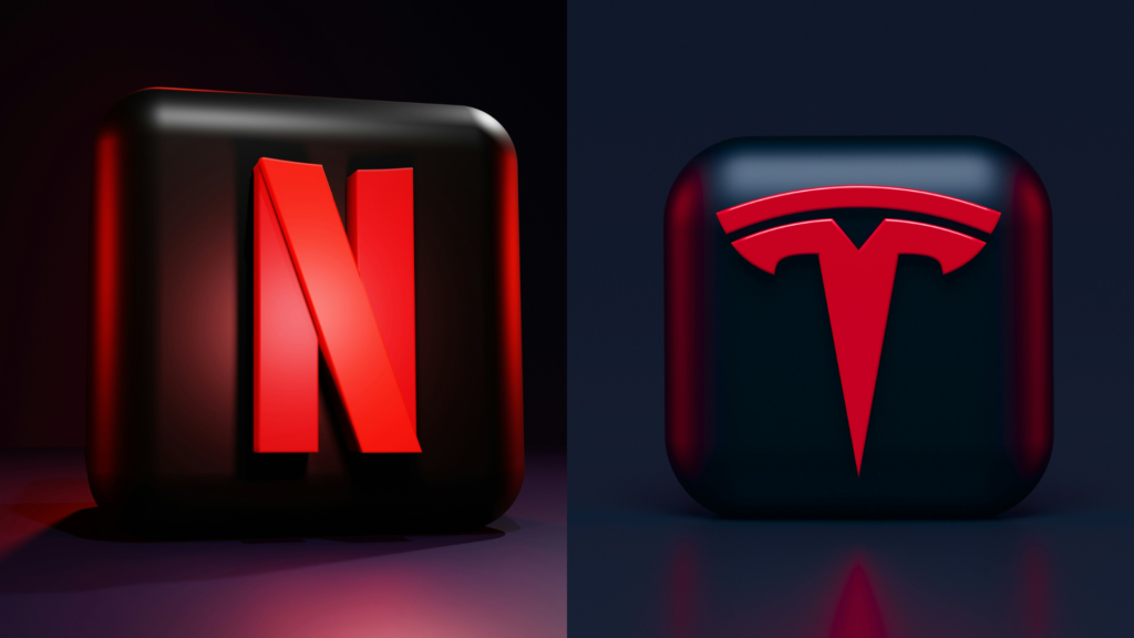
Red is a powerful color that evokes strong emotions like excitement, passion, and urgency. It’s a color that naturally grabs attention, making it perfect for brands aiming to stand out and create a sense of immediacy. This is why red is commonly used in industries that encourage quick decisions, such as fast food and retail.
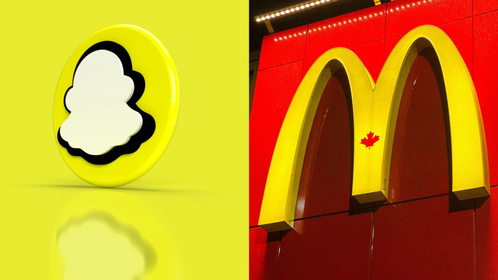
Fast-food giants like McDonald’s and Coca-Cola utilize red to stimulate appetite and convey a sense of energy. McDonald’s uses a red and yellow color scheme to stimulate hunger and excitement, encouraging impulsive purchases. Coca-Cola’s famous red packaging instantly identifies the brand on store shelves and instills a sense of urgency. The use of red effectively drives consumer action, whether making a purchase or satisfying a craving.
3. Green: The Color of Growth and Harmony
Green is synonymous with nature, health, and tranquility. It signifies growth, renewal, and balance, making it a favorite for brands focused on eco-friendliness, health, and wellness. Green’s link to the natural world makes it ideal for brands promoting sustainability or a connection to nature.
Brands like Whole Foods and Starbucks leverage green to reinforce their commitment to the environment and healthy living. The green logo and store design of Whole Foods highlight their focus on natural and organic items, making them appealing to customers who are health-conscious. Starbucks’ green mermaid symbolizes its commitment to sustainability and ethical sourcing, appealing to environmentally-conscious customers. Green successfully conveys a brand’s commitment to development, well-being, and environmental stewardship.

4. Yellow: The Color of Optimism and Cheerfulness
Yellow is bright, warm, and inherently optimistic. It evokes happiness, positivity, and friendliness, making it ideal for brands that want to appear approachable and joyful. Yellow’s cheerful nature can create a welcoming atmosphere, encouraging customers to engage with the brand.
IKEA and Snapchat are prime examples of brands that use yellow to convey a sense of optimism. IKEA’s use of yellow in branding and store design encourages exploration and creates a welcoming, approachable shopping environment. Snapchat’s lively yellow logo captures the app’s cheerful and playful approach to social media. These businesses project a warm, approachable, and widely appealing image by using yellow throughout their branding.
5. Black: The Color of Luxury and Sophistication
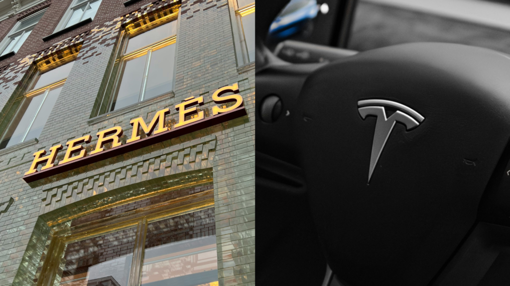
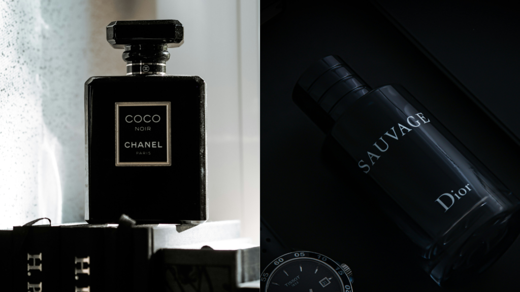
Black represents the epitome of elegance, sophistication, and luxury. Moreover, it’s a color that exudes power, authority, as well as exclusivity, making it a popular choice for high-end brands. Black’s association with luxury enables brands to position themselves as premium and desirable, thus attracting consumers who seek quality and status.
Luxury brands like Chanel and Louis Vuitton use black to convey exclusivity and timeless style. Chanel’s use of black in its logo and packaging enhances its reputation for high fashion and traditional elegance. Customers who appreciate elegance and workmanship are drawn to Louis Vuitton’s black and gold branding, which exudes sophistication and elegance. Black is ideal for brands seeking a posh and elegant image due to its association with refinement and prestige.
Understanding the psychological impact of colors is crucial in crafting a brand identity that resonates with consumers. Choosing hues that match your brand’s values and emotions not only shapes perception but also builds lasting connections with your audience. Whether seeking trust, excitement, harmony, optimism, or luxury, the right color choices can elevate your brand.
Creating a Cohesive Color Palette
After understanding the impact of colors, the next step is to create a cohesive palette that aligns with your brand’s identity. A well-thought-out palette not only enhances your brand’s visual appeal but also reinforces the core values you want to communicate. Here’s how to craft a color palette that’s both balanced and impactful:
1. Start with Your Brand’s Core Values
Your brand’s color palette should be a visual representation of its core values and message. Start by defining your brand’s core attributes—innovation, luxury, sustainability—and choose colors that reflect these qualities.
For a brand rooted in innovation and technology, choose a sleek, modern palette with shades of blue and silver. Blue, as mentioned earlier, symbolizes trust and professionalism, while silver adds a touch of modernity and sophistication. Together, these colors can help position your brand as a forward-thinking, reliable leader in the tech industry.
For a brand focused on nature and sustainability, use a palette of greens and earth tones to convey your environmental commitment. These colors create a genuine bond between your company and its values, appealing to consumers who value environmental responsibility.
2. Use a Color Wheel for Balance
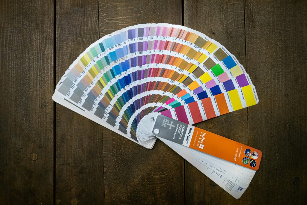
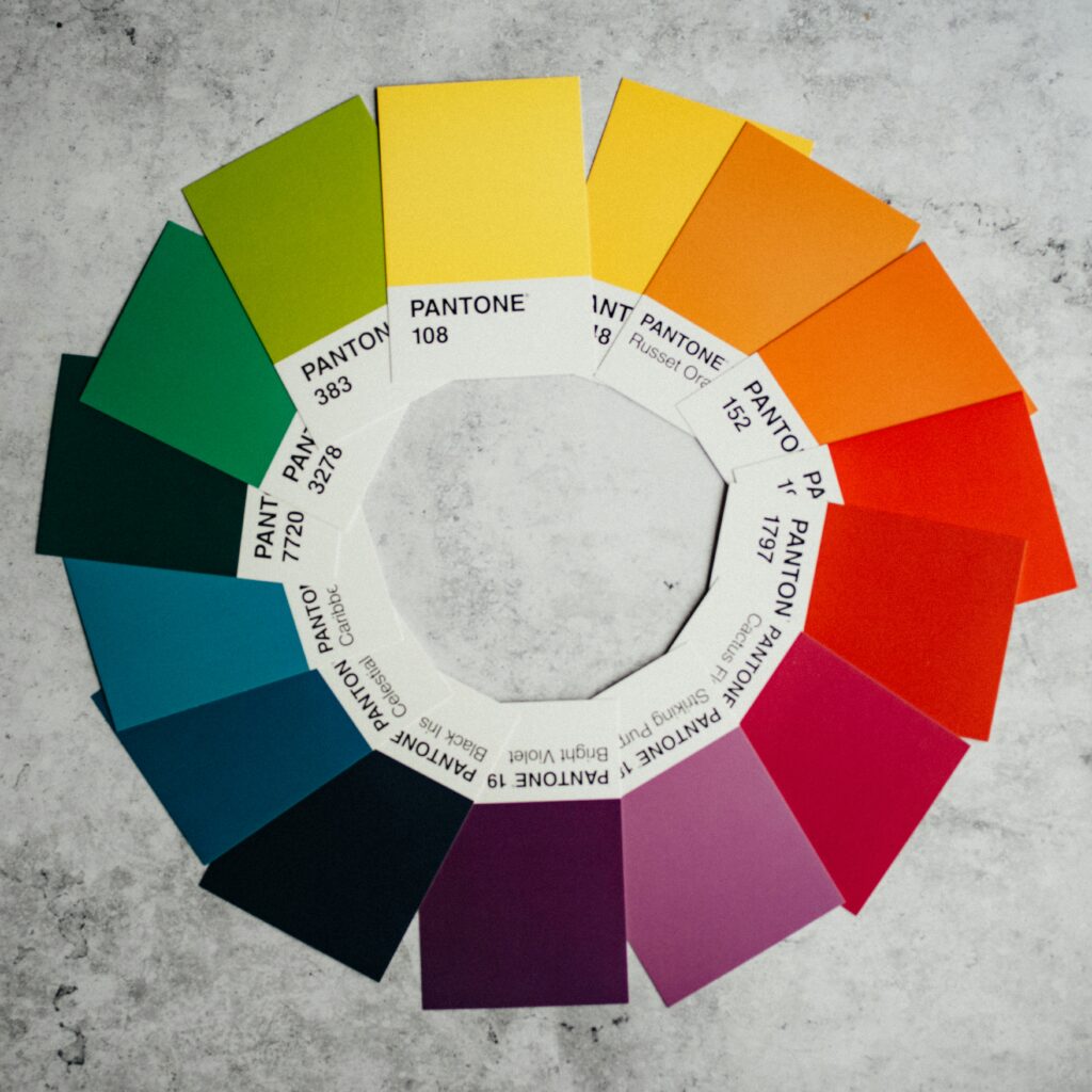
The color wheel is an invaluable tool for creating a harmonious and visually appealing palette. Understanding how colors interact on the wheel can guide you in making strategic choices that enhance your brand’s visual identity.
- Complementary Colors: These are colors opposite each other on the color wheel, like blue and orange or red and green. Using complementary colors creates a dynamic and eye-catching contrast that can make your brand stand out. Use contrasting colors wisely—too much contrast can overwhelm. It’s best to use one color as dominant and the other as an accent.
- Analogous Colors: These are colors that are next to each other on the color wheel, such as blue, teal, and green. Analogous colors create a more harmonious and cohesive look, ideal for brands that want to evoke calmness and unity. This approach suits brands in wellness, healthcare, or environmental services, where a soothing and consistent visual experience is key.
Using the color wheel ensures a balanced, visually pleasing palette. This creates a brand identity that resonates with your audience.
3. Incorporate Neutral Tones
Neutrals—such as black, white, gray, and beige—are the unsung heroes of any color palette. They provide the necessary balance and versatility, allowing your primary brand colors to shine without overwhelming the viewer.
- Black: Represents elegance and sophistication, making it a staple for luxury brands. When paired with brighter colors, black can create a striking and memorable visual contrast.
- White: Symbolizes purity, simplicity, and cleanliness. Brands like Apple use white to create a minimalist, high-end look, making their products stand out in a clutter-free environment.
- Gray: Offers a neutral ground that can add depth and sophistication to your palette. It’s commonly used to tone down brighter colors, thereby ensuring a polished and balanced look.
Incorporating neutrals into your palette provides flexibility across contexts—whether websites, packaging, or in-store displays—while maintaining a consistent, professional look.
4. Test and Adjust
After crafting your color palette, test it across different mediums to ensure it works effectively in all scenarios. Since colors can vary by medium—what looks vibrant on a screen might appear muted in print, and vice versa.
- Online: Test your palette on websites, social media, and digital ads. Ensure that your colors are consistent across various devices, from desktops to mobile screens. For instance, tools like Adobe Color or Canva can help simulate how your palette will appear online.
- Print: Print out your color palette on different materials to see how the colors translate in physical form. This is crucial for branding elements like business cards, brochures, and product packaging.
- In-Store: If your brand has a physical presence, test your colors in a real-world environment. Consider how lighting affects your palette and ensure colors align with the ambiance of your store or office.
During testing, be prepared to make adjustments. You may find that certain colors need to be tweaked to achieve the desired impact across all platforms. The goal is to create a color palette that is visually cohesive and consistently communicates your brand’s identity across all platforms.
Creating a cohesive color palette is a strategic process that goes beyond aesthetics. Choose colors that reflect your brand’s core values. Use the color wheel for balance and ensure consistency across all mediums. Following these steps will help you create a color palette that enhances your brand’s identity and strengthens audience connections.
Using Color Psychology in Marketing Materials
Color is crucial for reinforcing your brand identity across marketing materials, thus ensuring a consistent and memorable visual presence. Use color wisely across touchpoints, not only in your logo or website, to evoke emotions and create unified brand experience. Let’s look at some practical applications of color psychology in various marketing materials.
1. Website Design
Your website is often the first interaction with potential customers, making it essential for conveying your brand’s identity through color. The colors you choose should align with the emotions you want to evoke and the overall message of your brand.
- Primary Colors: Use your primary brand colors to highlight key elements like the navigation bar, call-to-action buttons, and headlines. For a wellness-focused brand, soothing greens and blues can both create a calming and welcoming online environment. These colors can highlight important information, like service offerings or subscriptions, while keeping a serene atmosphere.
- Background and Accents: The background color of your website should complement your primary colors without overpowering them. Neutral tones such as white or light gray can provide a clean backdrop, thereby allowing your brand colors to stand out. Accent colors can be used sparingly to highlight specific areas, such as promotional banners or special offers. For example, a wellness brand might use a soft pastel background with green accents to reinforce a sense of calmness.
- Consistency Across Pages: Ensure that the color scheme is consistent across all pages of your website. This consistency not only helps in creating a unified brand experience, but also makes it easier for users to navigate your site. A well-coordinated color palette guides users through their journey, reinforcing your brand identity with every click.

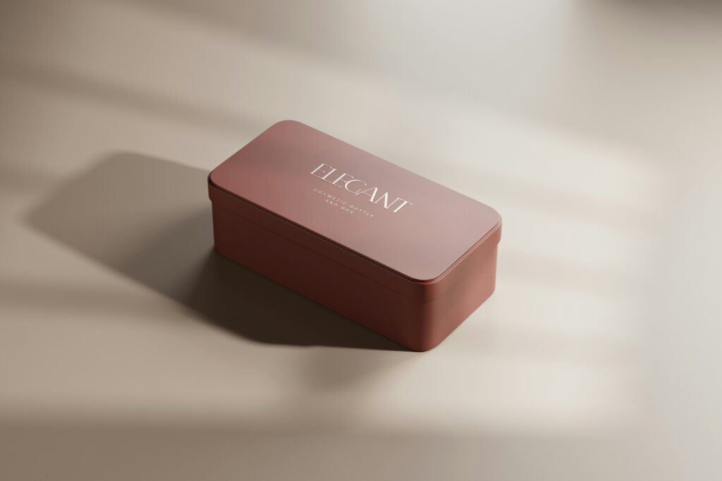
2. Packaging
Packaging is a vital touchpoint where color can make a lasting impression, both in-store and in unboxing experiences. In addition, packaging colors attract attention and communicate key aspects of your brand’s personality as well as its value proposition.
- Shelf Appeal: In a retail environment, your product needs to stand out among competitors, and color plays a major role in achieving this. Specifically, vibrant colors can grab attention and make your product more noticeable even on crowded shelves. For a youthful, energetic audience, bright colors like red, orange, or yellow convey excitement and energy. Conversely, deep hues like black, navy, or burgundy evoke luxury and sophistication, conveying premium quality and exclusivity.
- Unboxing Experience: The colors of your packaging also play a significant role in the unboxing experience, which has become a crucial aspect of customer satisfaction and brand loyalty. Subtle, sophisticated colors enhance luxury, while vibrant, cheerful colors create excitement and anticipation. A beauty brand might use soft pastels to create a calming effect, while incorporating gold accents to provide a touch of luxury.
- Eco-Friendly Branding: If sustainability is a core value of your brand, earthy tones like green, brown, and beige can reinforce your commitment to eco-friendliness. Packaging made from recycled materials in natural colors can further enhance this message, appealing to environmentally conscious consumers.
3. Social Media
Social media platforms are crucial for brand recognition. Consistent color use across these platforms boosts your brand’s visibility and memorability. Whether you’re posting images, videos, or stories, maintaining a cohesive color scheme helps build a strong, recognizable brand presence.
- Profile and Cover Photos: Your brand’s profile picture and cover photo are the first things users see when they visit your social media page. Using your primary brand colors in these visuals ensures immediate brand recognition. For example, a fashion brand might use vibrant colors reflecting the latest trends. In contrast, a financial services company may choose subdued, professional colors to convey stability and trustworthiness.
- Social Media Graphics: Incorporate your brand colors into the graphics and images you post on social media. This includes infographics, promotional images, and even quotes or testimonials. Consistent color use across these elements creates a cohesive look on social media. This makes your posts instantly recognizable to your audience.
- Story Highlights and Posts: Use your brand colors in Instagram story highlights and backgrounds to maintain consistency. When creating stories or reels, consider how your brand colors can be integrated into the content.When sharing behind-the-scenes content, use branded colors in text overlays and stickers. This keeps the content aligned with your brand identity.
- User-Generated Content: Encourage your followers to create and share content that features your brand colors. This not only boosts engagement but also amplifies your brand’s visual identity across different social media platforms. For instance, run a contest where users share photos of your product in action, emphasizing your brand colors. Reposting user-generated content reinforces your color scheme. It also creates a sense of community around your brand.

By consistently applying color psychology across your marketing materials, you create a unified brand experience that resonates with your audience. Strategic use of color in your website design, packaging, or social media can elevate your brand. It makes your brand more memorable, impactful, and effective in communicating core values.
Brands That Mastered Color Psychology
Color psychology is more than theory—it’s a strategic tool that can transform a brand into a cultural icon when used effectively. Let’s explore real-world examples of brands that have expertly used color psychology to build and enhance their brand identity.
1. Coca-Cola’s Iconic Red
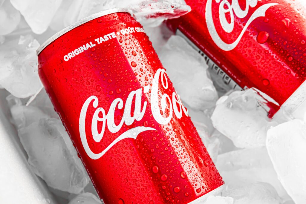
Coca-Cola is one of the most recognizable brands globally, largely due to its masterful use of color. Coca-Cola’s vibrant red is a carefully chosen hue that evokes strong emotions and associations.
- Emotion and Energy: Red is a color that universally symbolizes energy, excitement, and passion. These are exactly the emotions Coca-Cola wants to evoke in its consumers. Coca-Cola’s red color perfectly encapsulates joy, celebration, and living life to the fullest. Coca-Cola’s red branding makes any occasion—family gatherings, parties, or simple moments—feel lively and spirited.
- Global Recognition: The consistent use of red across all Coca-Cola products, advertisements, and marketing materials has made the color synonymous with the brand itself. From the classic glass bottle with its red label to the iconic holiday ads featuring Santa Claus in his red suit, Coca-Cola’s use of red has been a cornerstone of its brand identity for over a century. This global recognition is so strong that even a glimpse of the color and font combination is enough to trigger the brand in the minds of consumers.
- Brand Loyalty: Red also plays a role in creating a sense of urgency and appeal, encouraging consumers to make impulsive purchases. This is particularly effective in retail environments. The bold red stands out among other products, catching the eye and prompting an immediate purchase. The color red fosters an emotional connection, helping Coca-Cola maintain strong brand loyalty. Consumers associate red with positive experiences with the product.
2. Tiffany & Co.’s Signature Blue
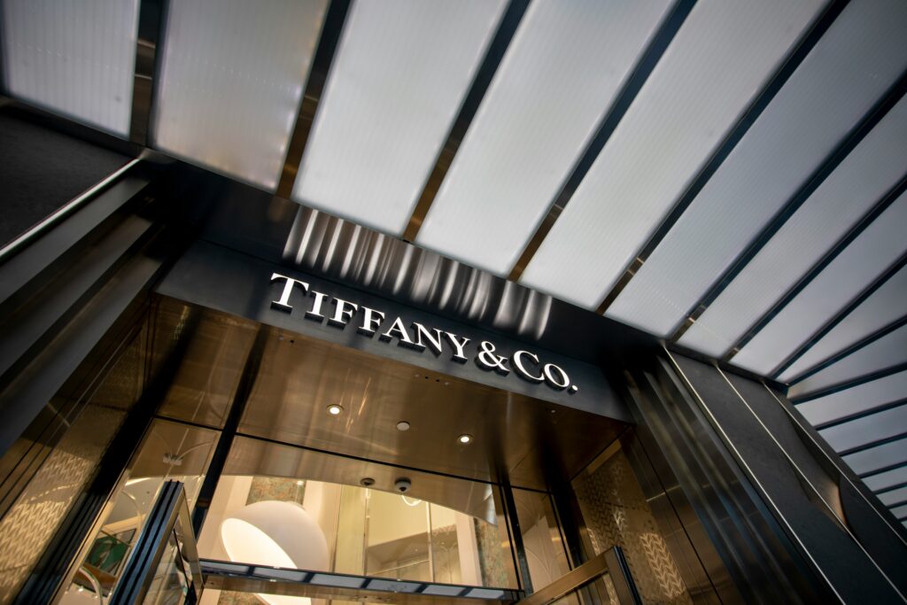
Tiffany & Co., the world-renowned luxury jewelry brand, has mastered the art of color psychology with its exclusive and elegant shade of blue, known as “Tiffany Blue.” This specific hue has become almost as iconic as the brand itself, symbolizing sophistication, luxury, and timeless elegance.
- Exclusivity and Elegance: Tiffany Blue is not just a color; it’s a statement. The delicate, robin’s egg blue is instantly recognizable and has become a symbol of luxury and exclusivity. It’s a color that exudes a sense of calm and elegance, aligning perfectly with Tiffany & Co.’s brand values. When customers see Tiffany Blue, they think of high-end, meticulously crafted jewelry and the luxurious experience of Tiffany & Co.
- Trademarked Identity: Tiffany & Co. has taken its use of color to the next level by trademarking Tiffany Blue, ensuring that no other brand can use this specific shade in the same way. This strategic move has cemented the color’s association with the brand, making it an integral part of its identity. The iconic Tiffany Blue box with a white ribbon symbolizes anticipation and delight. It represents special occasions like engagements and anniversaries.
- Emotional Connection: The emotional response triggered by Tiffany Blue is one of calm, trust, and luxury. The brand uses Tiffany Blue to build a strong emotional connection, creating trust and reliability with its customers. Whether it’s a first purchase or a return, Tiffany Blue evokes joy and exclusivity. This makes each brand interaction memorable.
3. Starbucks’ Earthy Green
Starbucks has built its global brand not just on its coffee, but also on its strong commitment to sustainability, ethical sourcing, and a connection to nature. The brand’s use of green is a key component of this identity, reflecting its environmental values and resonating with its target audience.
- Sustainability and Nature: Green is universally associated with nature, health, and growth—all values that are central to Starbucks’ brand. The green in Starbucks’ logo is a constant reminder of the company’s commitment to sustainability and its efforts to source coffee ethically. This color choice aligns the brand with environmentally conscious consumers who value responsible business practices.
- Brand Recognition: The green mermaid logo is not just a symbol of the brand but also a representation of its values. The consistent use of green across Starbucks’ stores, merchandise, and marketing materials helps create a cohesive brand experience that is instantly recognizable worldwide. Whether you’re in New York, Tokyo, or Paris, the familiar green logo evokes a sense of reliability and quality.
- Calming and Welcoming Atmosphere: Starbucks uses green not just in its logo but throughout its store interiors as well. The earthy tones in its design create a calming and welcoming environment, encouraging customers to relax and enjoy their time in the café. This atmosphere aligns with the brand’s goal of being a “third place” between home and work where customers can unwind and socialize.
- Community and Connection: The green branding also extends to Starbucks’ community initiatives and environmental campaigns, further reinforcing the brand’s connection to nature and social responsibility. By consistently using green, Starbucks communicates that it is a brand that cares—not just about profit, but about people and the planet.

These brands demonstrate the powerful impact that color psychology can have when applied strategically in branding. Coca-Cola, Tiffany & Co., and Starbucks have all successfully harnessed the emotional and psychological effects of color to build strong, iconic brands. By understanding and leveraging color psychology in your own branding efforts, you can create a brand identity that resonates deeply with your audience and stands the test of time.
Visualizing Your Brand’s Color Story: Mood Boards and Beyond
Creating a cohesive and impactful color story for your brand goes beyond simply choosing colors; it requires thoughtful visualization and testing to ensure that your palette effectively communicates your brand’s identity across all touchpoints. Visualization tools like mood boards and mockups help bring your brand’s color story to life and ensure consistency. Here’s how you can effectively use these tools to refine and perfect your brand’s color palette.
1. Building a Mood Board
A mood board visually represents your brand’s aesthetic, values, and messaging through images, textures, and color swatches. It’s an essential branding tool that shows how elements interact to tell your brand’s story.
- Collecting Visual Inspiration: Start by gathering images, textures, patterns, and color swatches that resonate with the emotions and messages you want your brand to convey, thus setting a strong foundation for your mood board. Think about the core values of your brand and how they can be represented visually. For instance, if your brand is centered around innovation and technology, you might include sleek, modern images with metallic textures and cool-toned color swatches like silver, navy, and charcoal.
- Organizing Your Board: Once you’ve collected your visual elements, organize them into a cohesive board that clearly communicates your brand’s personality. You can arrange the images and colors in a way that flows naturally and highlights the key themes of your brand. For example, if your brand is focused on luxury and exclusivity, your mood board might feature rich, deep colors like emerald green or burgundy, paired with textures like velvet or silk.
- Digital Tools for Mood Boards: While traditional mood boards can be created with physical materials like magazine clippings and fabric samples, digital tools offer greater flexibility and accessibility. Platforms like Pinterest, Adobe Spark, and Canva allow you to create digital mood boards, where you can easily drag and drop images, adjust color swatches, as well as experiment with different layouts. These tools also enable you to share your mood board with your team or clients, making collaboration easier.
- Refining Your Vision: As you build your mood board, you’ll start to see patterns emerge. This is your opportunity to refine your vision and ensure that every element on the board aligns with your brand’s identity, thereby enhancing overall coherence. If certain colors or images don’t fit the overall theme, don’t hesitate to remove or replace them. The goal is to create a mood board that serves as a clear and focused representation of your brand’s color story.

2. Using Mockups to Test Your Colors
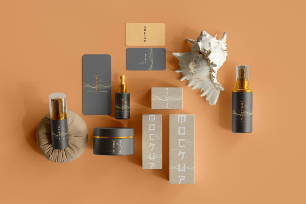
While mood boards help you visualize your brand’s aesthetic, mockups allow you to see how your chosen colors will work in real-world applications. Testing your colors on different marketing materials through mockups ensures that your palette is not only visually appealing but also practical and effective.
- Creating Mockups for Marketing Materials: Start by creating mockups for essential marketing materials like business cards, brochures, packaging, and social media posts. These mockups will give you a realistic preview of how your brand colors will look when applied to different formats. For example, if your brand’s primary color is a bold red, a mockup can show you how it will look on a business card next to your logo and contact information. Will the red be too overwhelming, or will it create a striking and memorable impression?
- Testing Across Different Mediums: It’s crucial to test your colors across various mediums, including digital and print, to ensure consistency. Colors can appear differently depending on the medium and lighting, so what looks great on a computer screen might not have the same impact in print. By using mockups, you can adjust your color choices as needed to achieve the desired effect in every context. For instance, a vibrant orange that pops on a website might need to be toned down for print materials to avoid looking too harsh.
- Feedback and Iteration: Share your mockups with colleagues, clients, or even a focus group to gather feedback. This input can be invaluable in refining your color choices and thus ensuring that they resonate with your target audience. If you receive feedback that a certain color feels too bold or doesn’t align with your brand message, then don’t be afraid to make adjustments, as this ensures your brand remains consistent and effective. The mockup stage is the perfect time to experiment and iterate until you find the perfect balance.
- Expanding Your Testing: Beyond standard marketing materials, you should consider testing your colors on larger-scale applications, such as storefronts, billboards, or vehicle wraps, if relevant to your brand. This will help you understand how your colors perform in different environments and at different scales. For example, a pastel color that looks soft and inviting on a small-scale package might lose its impact on a large outdoor sign, where bolder colors might be more effective.
Conclusion
Color psychology goes beyond aesthetics, serving as a powerful branding tool that influences behavior and shapes perceptions. By leveraging the psychological impact of colors, you can craft a brand identity that not only captures attention but also connects emotionally with your audience. Whether it’s the trust-building blues or the energetic reds, every hue you choose contributes to how your brand is perceived and remembered.
Incorporating a thoughtfully chosen color palette that reflects your brand’s core values is key to creating a lasting impression. This strategic use of color not only differentiates your brand in a crowded market but also makes it more memorable and impactful. So, as you develop your brand’s visual identity, remember that colors are more than just design choices—they are powerful tools that can tell your brand’s story and foster a deep, emotional connection with your audience.

