Your logo is the face of your brand. It’s the first thing people notice and the lasting impression they have of your company. It’s the visual representation of your brand’s identity, values, and personality. That’s why it’s crucial to design a logo that not only looks great but also effectively communicates your brand’s message and values.
In today’s competitive market, a well-designed logo can make all the difference in attracting and retaining customers. It’s the foundation of your brand’s visual identity and can help you stand out from the crowd. A strong logo can also increase brand recognition, build trust, and create a lasting impression in the minds of your target audience.
However, designing a successful logo is not as simple as it may seem. It requires a deep understanding of the science behind visual communication, as well as a keen eye for aesthetics. In this blog post, we’ll dive into the art and science behind logo design and share tips on how to craft a symbol of success for your brand.
Whether you’re a small business owner looking to create your first logo or a seasoned marketer looking to refresh your brand’s visual identity, this guide will provide you with the insights and inspiration you need to create a winning logo that resonates with your audience and drives business growth.
The Importance of Simplicity in Logo Design
One of the most fundamental principles of effective logo design is simplicity. A simple logo has the power to captivate audiences, leaving a lasting impression that transcends time and trends. When executed well, a minimalist logo design can achieve several key objectives:
1. Easy Recognition
A simple logo is inherently easier for consumers to recognize. This recognition is vital in a world saturated with visual stimuli.
- Cognitive Load: Our brains are wired to process simple shapes and forms more quickly than complex ones. A straightforward design minimizes cognitive load, allowing consumers to identify and remember the logo almost instinctively.
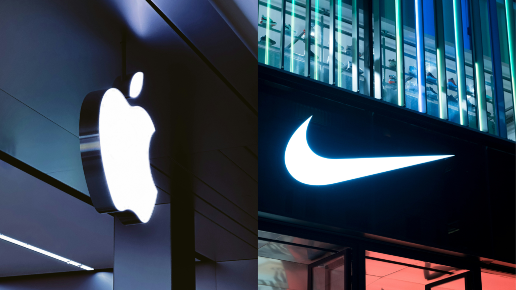
- Brand Recall: For example, think of the Nike swoosh. Its clean, fluid shape can be recognized at a glance, even from a distance or when viewed in passing. This immediate recognition fosters brand recall, making it easier for consumers to associate the logo with the brand’s products and values.
2. Versatility Across Media
A simple logo is highly adaptable, which is essential for maintaining a consistent brand presence across various platforms and formats.
- Scalability: Simple logos can be resized without losing clarity or impact. Whether it’s displayed on a large billboard, printed on a small business card, or used as an app icon, the logo remains effective and legible.
- Multi-Platform Use: In today’s digital age, logos appear on websites, social media, merchandise, and more. A simple design works well across all these mediums, ensuring that the brand is consistently represented, no matter the context.
3. Timeless Appeal
Simplicity lends itself to timelessness, allowing a logo to remain relevant and appealing over the years.
- Avoiding Trends: Complex logos often fall victim to design trends that can quickly become outdated. A simple logo focuses on essential elements, making it less likely to feel dated. For instance, the Nike swoosh has maintained its relevance since its inception in 1971, largely due to its minimalist design.
- Longevity: Brands that invest in a simple logo can enjoy long-term recognition without the need for frequent redesigns. This longevity can lead to deeper brand loyalty, as consumers come to associate the logo with the brand’s history and values.
4. Memorability
Memorability is a critical component of effective branding, and simple logos excel in this area.
- Ease of Recall: Simple logos are easier for consumers to remember. Research shows that people are more likely to recall images that are uncomplicated. A straightforward design sticks in the mind, leading to better brand recall when consumers are making purchasing decisions.
- Associative Memory: The brain tends to create strong associations with simple, clear images. When consumers see a simple logo repeatedly, it becomes ingrained in their memory, making it more likely that they will think of the brand in the future.
5. Emotional Connection
Simplicity can foster a deeper emotional connection between the brand and its audience.
- Core Essence: A minimalist logo strips away unnecessary elements, allowing the brand’s core essence to shine through. This focus can resonate with consumers on a more profound level, creating a sense of familiarity and trust.
- Symbolism: Simple logos often carry symbolic meanings that can evoke emotions. For example, the Nike swoosh symbolizes movement and speed, aligning perfectly with the brand’s focus on athleticism and performance. This emotional connection can lead to increased brand loyalty and advocacy.
Simplicity is a cornerstone of effective logo design. A simple logo is not only easier to recognize and remember, but it also adapts well across various media, maintains a timeless appeal, and fosters emotional connections with consumers. The Nike swoosh serves as a prime example of how a well-executed, minimalist logo can transcend its original purpose to become an iconic symbol of a brand. When embarking on your logo design journey, prioritize simplicity to ensure your brand’s essence is communicated clearly and effectively.

Choosing the Right Colors in Logo Design
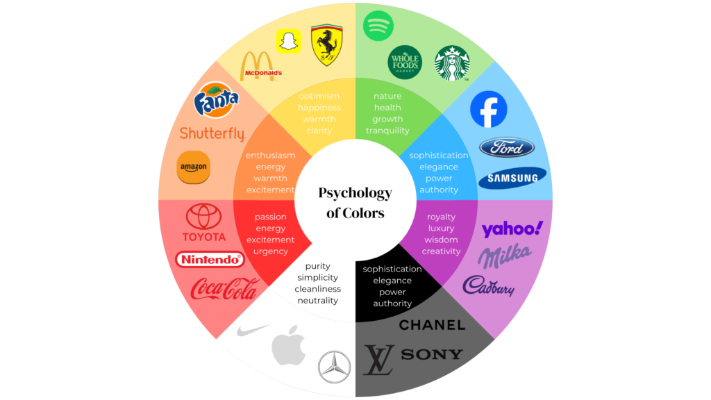
Color is a powerful tool in logo design, playing a crucial role in how a brand is perceived. The colors you choose can evoke specific emotions, create associations, and communicate your brand’s personality. Understanding the psychological impact of colors is essential for crafting a logo that resonates with your target audience.
1. Emotional Associations of Colors
Different colors evoke different emotions and associations, which can significantly influence consumer behavior. Here are some common color associations:
- Red: Often symbolizes passion, energy, and excitement. It can grab attention and create a sense of urgency, making it popular in industries like food and entertainment. Brands like Coca-Cola and Target effectively use red to evoke excitement and enthusiasm.
- Blue: Associated with trust, stability, and intelligence. It is commonly used by financial institutions and tech companies to convey reliability. For instance, brands like IBM and Facebook utilize blue to instill confidence in their users.
- Yellow: Represents optimism, cheerfulness, and warmth. It can attract attention and is often used in marketing to create a friendly and inviting atmosphere. Brands like McDonald’s use yellow to evoke feelings of happiness and friendliness.
- Green: Symbolizes nature, health, and tranquility. It is frequently used by brands in the organic and wellness sectors, such as Whole Foods and Starbucks, to convey a commitment to sustainability and health.
- Black: Conveys sophistication, elegance, and authority. It is often used in luxury brands like Chanel and Gucci to create a sense of exclusivity and high quality.
Understanding these associations is crucial when selecting colors for your logo, as they can shape how consumers perceive your brand.
2. The Role of Color in Brand Identity
The colors you choose for your logo should align with your brand’s personality and the message you want to convey. Here are some considerations:
- Target Audience: Consider the demographics and preferences of your target audience. Different age groups, cultures, and genders may have varying emotional responses to colors. For example, younger audiences may respond well to vibrant, bold colors, while older audiences may prefer more muted, classic tones.
- Industry Standards: Certain industries have established color norms that consumers recognize. For instance, blue is prevalent in the tech and finance sectors, while green is often associated with health and wellness. Aligning your color choices with industry standards can help your brand feel more credible and trustworthy.
- Brand Values: Your logo colors should reflect your brand’s core values. If your brand emphasizes sustainability, incorporating green tones can reinforce that message. Alternatively, if your brand is about innovation and creativity, brighter colors like orange or purple may be more appropriate.
3. Color Combinations and Contrast
When selecting colors for your logo, consider how they will interact with each other. Effective color combinations can enhance visual appeal and create a sense of balance. Here are some tips:
- Contrast: High-contrast color combinations, such as blue and orange or black and yellow, can create a dynamic and eye-catching logo. These combinations draw attention and make the logo more memorable.
- Harmony: Colors that are adjacent on the color wheel, such as blue and green, create a sense of harmony and unity. This can be effective for brands that want to convey a calm and cohesive image.
- Brand Differentiation: Using unique color combinations can help your brand stand out from competitors. For example, if most brands in your industry use blue, opting for a different color palette can make your logo more distinctive.
Choosing the right colors for your logo is a critical aspect of brand identity and communication. By understanding the emotional associations of colors, considering your target audience and industry standards, and analyzing successful examples like the Apple logo, you can create a logo that effectively conveys your brand’s message and resonates with consumers. Remember, color is not just a visual element; it’s a powerful tool that can influence perceptions and drive consumer behavior.
Balancing Shape and Negative Space in Logo Design
The shape of your logo is a critical element that significantly influences its effectiveness and the emotions it evokes. Different shapes carry distinct meanings and connotations, making it essential to choose shapes that align with your brand’s identity. Additionally, the use of negative space—the area surrounding and between the elements of your logo—plays a vital role in creating balance, visual interest, and even hidden messages.
1. The Significance of Shape
Shapes are not just aesthetic choices; they communicate specific ideas and feelings. Here are some common shapes and their associated meanings:
- Circles: Often symbolize unity, wholeness, and infinity. They convey a sense of community and inclusiveness, making them ideal for brands focused on connection and collaboration. For example, the logo for the Olympic Games uses interlocking circles to represent unity among nations.
- Squares and Rectangles: Associated with stability, reliability, and structure. These shapes convey a sense of order and professionalism, making them popular in industries like finance and construction. Brands like Microsoft use square shapes to emphasize their reliability and solid foundation.
- Triangles: Often represent direction, power, and innovation. Depending on their orientation, triangles can convey different meanings; for instance, an upward-pointing triangle suggests growth and aspiration, while a downward-pointing triangle may imply stability. The logo for Delta Airlines uses a triangular shape to symbolize flight and progress.
- Organic Shapes: These shapes, which are often irregular and fluid, can evoke feelings of creativity and approachability. Brands in the arts or wellness sectors may opt for organic shapes to convey a sense of warmth and friendliness.
Choosing the right shape for your logo is essential, as it sets the tone for how your brand is perceived.

2. The Power of Negative Space
Negative space refers to the empty space around and between the elements of a logo. It is a powerful design tool that can enhance the overall composition and meaning of the logo. Here’s how negative space can be effectively utilized:
- Creating Balance: Negative space can help achieve visual balance in a logo. By allowing elements to breathe, designers can create a harmonious composition that is aesthetically pleasing. For example, the logo for the World Wildlife Fund (WWF) uses negative space to create the shape of a panda, allowing the logo to remain simple yet impactful.
- Adding Visual Interest: Clever use of negative space can add depth and intrigue to a logo. It encourages viewers to look closer and discover hidden meanings or messages. The FedEx logo is a prime example, where the negative space between the “E” and “x” forms an arrow, symbolizing speed and precision. This subtle detail enhances the brand’s identity without overwhelming the viewer.
- Creating Hidden Messages: Negative space can be used to incorporate secondary images or messages that reinforce the brand’s values. For instance, the logo for the Spartan Golf Club cleverly combines a golfer swinging a club with a Spartan helmet, using negative space to merge two concepts into one cohesive design. This approach not only makes the logo visually engaging but also communicates the brand’s dual focus on golf and heritage.

3. Best Practices for Using Negative Space
To effectively incorporate negative space into your logo design, consider the following best practices:
- Plan Ahead: Integrate negative space into the initial design phase rather than as an afterthought. This foresight allows for a more organic design process and can lead to a more cohesive final product.
- Iterate and Simplify: Start with a more complex design and gradually simplify it, focusing on the essential elements. This process helps identify opportunities for effective use of negative space while reducing clutter.
- Test for Clarity: Ensure that the logo remains clear and recognizable at various sizes and backgrounds. A well-designed logo should be effective in both large formats, like billboards, and small formats, like business cards.
- Seek Professional Input: If you’re unsure about your design, consulting a professional graphic designer can provide valuable insights and expertise. They can help balance the positive and negative space effectively, ensuring that the logo communicates your brand’s message clearly.
Balancing shape and negative space is crucial in logo design. The shapes you choose convey specific meanings and emotions, while negative space enhances the overall composition, adds visual interest, and can even communicate hidden messages. By understanding the significance of shapes and effectively utilizing negative space, you can create a logo that not only stands out but also resonates with your audience. The FedEx logo exemplifies how clever use of negative space can elevate a design, making it memorable and impactful. When designing your logo, prioritize these elements to craft a symbol that truly represents your brand.
Choosing the Right Font in Logo Design
Typography is a fundamental element of logo design, as it conveys a brand’s personality and message through visual language. The font you choose can significantly influence how your brand is perceived, making it essential to select a typeface that aligns with your brand identity. Here’s a closer look at the role of typography in logo design and how to choose the right font for your brand.
1. Understanding Font Categories
Fonts can be broadly categorized into several types, each carrying its own connotations and emotional associations:
- Serif Fonts: These fonts feature small decorative lines or “serifs” at the ends of their letters. They are often associated with tradition, reliability, and elegance. Brands that want to convey a sense of heritage or authority often opt for serif fonts. For example, the Times New Roman font is widely used in print media and formal documents, reflecting professionalism and trustworthiness.
- Sans-Serif Fonts: Sans-serif fonts lack the decorative serifs, giving them a clean and modern appearance. These fonts are associated with simplicity, minimalism, and contemporary design. Brands like Google and Facebook use sans-serif fonts to project a modern and approachable image, appealing to a tech-savvy audience.
- Script Fonts: Script fonts mimic handwritten text and can convey a sense of personality, creativity, and individuality. They are often used by brands that want to appear friendly and personal, such as in the beauty or artisanal sectors. However, script fonts should be used carefully, as they can sometimes sacrifice legibility.
- Display Fonts: These are decorative fonts designed to stand out and grab attention. They are often used in logos for brands that want to convey a unique personality or artistic flair. However, they may not be suitable for all applications, as they can be less readable in smaller sizes.
2. Aligning Fonts with Brand Personality
When selecting a font for your logo, consider how it aligns with your brand’s personality and values:
- Target Audience: Think about who your audience is and what type of font would resonate with them. A playful, handwritten font may appeal to a younger demographic, while a classic serif font may attract a more mature audience.
- Brand Values: Your font should reflect your brand’s core values. For example, a luxury brand might choose an elegant serif font to convey sophistication, while an eco-friendly brand might opt for a clean sans-serif font to emphasize simplicity and sustainability.
- Industry Norms: Different industries often have established typographic conventions. For instance, financial institutions typically use conservative serif fonts to project stability, while tech companies may favor modern sans-serif fonts to convey innovation.
3. Best Practices for Choosing Fonts
When selecting a font for your logo, keep the following best practices in mind:
- Legibility: Ensure that your chosen font is legible at various sizes and formats. A logo should be easily recognizable, whether on a business card or a billboard.
- Versatility: Choose a font that works well across different media and applications. It should maintain its integrity in both print and digital formats.
- Timelessness: Opt for a font that won’t quickly go out of style. Avoid overly trendy fonts that may not stand the test of time.
- Test and Iterate: Experiment with different fonts and combinations before finalizing your design. Gather feedback from potential customers to see which font resonates best with your audience.
The Coca-Cola logo is a masterful example of typography’s role in brand identity, featuring the iconic Spencerian script, a cursive font popular in the late 19th century. This elegant typeface evokes tradition and nostalgia, aligning perfectly with Coca-Cola’s heritage as a classic American beverage. The flowing script creates a sense of warmth and familiarity, fostering an emotional connection with consumers that has contributed to the brand’s lasting recognition. The logo’s distinctive curvature, especially in the two capital “C”s, ensures memorability, while the bold red color enhances its impact, symbolizing passion and excitement. Together, the typography and color combine to form a powerful visual identity that resonates deeply with audiences.

Choosing the right font for your logo is a critical aspect of brand identity. Typography not only conveys your brand’s personality but also influences how consumers perceive and connect with your brand. By understanding the different font categories, aligning your choice with your brand values, and learning from successful examples like the Coca-Cola logo, you can create a logo that effectively communicates your brand’s message and resonates with your target audience. Remember, the right font can elevate your logo from ordinary to iconic, making it a powerful tool in your branding arsenal.
Conclusion
When designing your logo, it’s important to consider all of the elements we’ve discussed and how they work together to create a cohesive and effective design. Your logo should be simple, memorable, and versatile, and it should effectively communicate your brand’s message and values.
A cohesive logo design ensures that all the elements work together seamlessly to create a unified and impactful visual identity. When simplicity, color, shape, negative space, and typography are aligned, the logo becomes more than just a collection of individual parts; it becomes a powerful representation of your brand’s essence.
Remember, your logo is the face of your brand, so it’s important to get it right. By following the principles of logo design and using the right colors, shapes, and fonts, you can craft a symbol of success for your brand that resonates with your audience and drives business growth. A simple, memorable logo can increase brand recognition, build trust, and create a lasting impression in the minds of your target audience.
Ultimately, your logo is a reflection of your brand’s personality and values. By embracing simplicity, leveraging the power of color and shape, utilizing negative space effectively, and choosing the right typography, you can create a logo that stands the test of time and sets your brand apart from the competition. With a well-designed logo, you can craft a symbol of success that captures the essence of your brand and inspires loyalty and advocacy among your customers.




nice